The creation process of dzn’s hawk logo.
Brief
We sat down to brainstorm ideas and pretty much hit upon a hawk straight away. It represents our mantra perfectly.. ‘be seen’.
Research
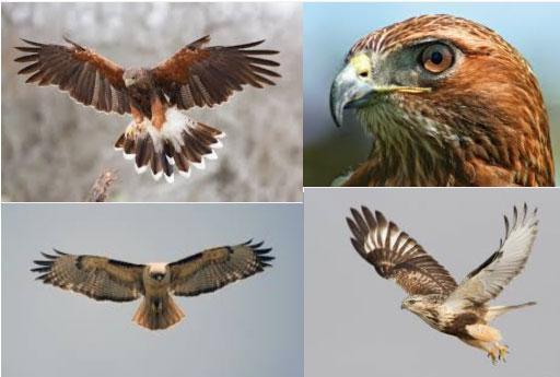
We studied some images of hawks & videos of them in-flight, just to get a feel for this awesome animal and a basis on which to start sketching out some ideas.
Sketch time
After a few initial doodles, we start to refine our favourite concepts.
Selection time
We chose the logo for it’s simplicity, elegance, scalability, B&W & would work well for a landing animation.
(check out the menu)
The crafting of the logo on the mac begins.
Using Geometric, golden-ratio principles, we forge out the shape of the hawk, to create a visually appealing shape. Numbers can be beautiful!
Once satisfied, we settle on this logo. Then we fan through various colour options.
Et Voila
Like it?


